멈춰 있을 때보다 걸을 때 더 예쁜 옷에는 이유가 있어요 | Why Some Outfits Look Better in Motion

지금 보고 있는 영상

멈춰 있을 때보다 걸을 때 더 예쁜 옷에는 이유가 있어요 | Why Some Outfits Look Better in Motion
조회수 1,125
영상 설명 · 눌러서 펼치기
프린지의 매력은 정지된 순간보다 움직일 때 더 선명해집니다. 컬러와 실루엣은 단정하게, 시선은 자연스럽게 따라오게 만든 여섯 가지 스타일을 담았어요.
Fringe reveals its real beauty in motion. Six looks pair clean silhouettes with flowing details that naturally draw the eye.
LOOK 1
❤️ 블랙 드레스 위로 길게 흐르는 레드 프린지가 걸음마다 강렬한 대비를 만듭니다.
Long red fringe over a black dress creates dramatic contrast with every step.
LOOK 2
❄️ 아이스 블루 드레스와 밝은 프린지가 설경과 이어지며 가볍고 우아하게 흐릅니다.
Icy blue tones and pale fringe echo the snowy setting with a light, elegant flow.
LOOK 3
💚 라임 드레스에 퍼플 계열 프린지를 겹쳐 컬러의 긴장감과 움직임을 함께 살렸어요.
A lime dress paired with purple-toned fringe brings color tension and movement together.
LOOK 4
🤎 차분한 브라운 드레스 위 골드빛 프린지가 움직일 때마다 은은한 존재감을 더합니다.
Gold-toned fringe adds subtle impact to the calm brown dress as it moves.
LOOK 5
🌺 선명한 핑크 드레스와 레드·퍼플 프린지가 겹쳐져 걸을수록 컬러가 풍성해집니다.
Layered red and purple fringe gives the vivid pink dress even more depth in motion.
LOOK 6
🌙 깊은 네이비 위로 골드 프린지가 길게 떨어져 차분함과 화려함을 동시에 보여줍니다.
Long gold fringe against deep navy balances quiet elegance with a touch of drama.
프린지는 단순한 장식보다 움직임을 디자인하는 요소에 가깝습니다. 같은 롱드레스도 컬러 대비와 프린지의 흐름에 따라 전혀 다른 분위기로 보이는 여섯 가지 스타일을 만나보세요.
Fringe does more than decorate—it shapes the way an outfit moves. See how color contrast and flowing details give six long-dress looks completely different personalities.
Fringe reveals its real beauty in motion. Six looks pair clean silhouettes with flowing details that naturally draw the eye.
LOOK 1
❤️ 블랙 드레스 위로 길게 흐르는 레드 프린지가 걸음마다 강렬한 대비를 만듭니다.
Long red fringe over a black dress creates dramatic contrast with every step.
LOOK 2
❄️ 아이스 블루 드레스와 밝은 프린지가 설경과 이어지며 가볍고 우아하게 흐릅니다.
Icy blue tones and pale fringe echo the snowy setting with a light, elegant flow.
LOOK 3
💚 라임 드레스에 퍼플 계열 프린지를 겹쳐 컬러의 긴장감과 움직임을 함께 살렸어요.
A lime dress paired with purple-toned fringe brings color tension and movement together.
LOOK 4
🤎 차분한 브라운 드레스 위 골드빛 프린지가 움직일 때마다 은은한 존재감을 더합니다.
Gold-toned fringe adds subtle impact to the calm brown dress as it moves.
LOOK 5
🌺 선명한 핑크 드레스와 레드·퍼플 프린지가 겹쳐져 걸을수록 컬러가 풍성해집니다.
Layered red and purple fringe gives the vivid pink dress even more depth in motion.
LOOK 6
🌙 깊은 네이비 위로 골드 프린지가 길게 떨어져 차분함과 화려함을 동시에 보여줍니다.
Long gold fringe against deep navy balances quiet elegance with a touch of drama.
프린지는 단순한 장식보다 움직임을 디자인하는 요소에 가깝습니다. 같은 롱드레스도 컬러 대비와 프린지의 흐름에 따라 전혀 다른 분위기로 보이는 여섯 가지 스타일을 만나보세요.
Fringe does more than decorate—it shapes the way an outfit moves. See how color contrast and flowing details give six long-dress looks completely different personalities.
코디 하우 | CODI HOW 다른 영상

허리 아래 10cm가 전체 비율을 바꾸는 결정적인 구간 | The 10cm Below the Waist That Changes the Whole Look
조회수 1,377

컬러를 많이 써도 세련돼 보이는 이유, 이 6가지 배색에 있어요 | Why These Bold Color Mixes Still Look Chic
조회수 254

화려한 아우터일수록 안쪽을 한 색으로 맞추면 달라집니다 | One-Color Underlayers Make Statement Outerwear Feel Refined
조회수 2,398
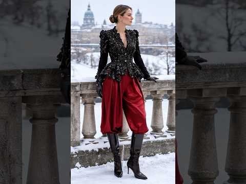
아래는 넉넉하게, 위는 잘록하게…이 반대 비율이 우아하다 | Loose Below, Defined Above—Why This Contrast Looks So Elegant
조회수 1,217

출근룩처럼 단정한데 여행지에서도 살아나는 컬러 조합 | Polished Enough for Work, Vibrant Enough for a City Escape
조회수 1,481

부해 보일 것 같은 볼륨을 오히려 날씬하게 입는 법 | How to Wear Bold Volume Without Looking Overwhelmed
조회수 1,150

프릴이 많아도 우아해 보이는 룩은 무엇이 다를까요? | What makes ruffles look elegant instead of overwhelming?
조회수 2,531
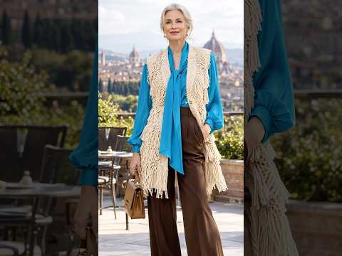
같은 와이드 팬츠도 상체 컬러에 따라 비율이 달라 보입니다 | How top color changes the balance of wide-leg pants
조회수 608