상의와 스커트 색을 굳이 맞추지 않아도 되는 이유 | Why Your Top and Skirt Don’t Need to Match

지금 보고 있는 영상

상의와 스커트 색을 굳이 맞추지 않아도 되는 이유 | Why Your Top and Skirt Don’t Need to Match
조회수 50
영상 설명 · 눌러서 펼치기
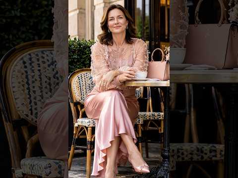
컬러를 맞추는 대신 서로 다른 색의 힘을 살리면 스타일이 훨씬 흥미로워집니다. 선명한 배색을 우아하게 연결한 여섯 가지 룩을 만나보세요.
Instead of matching colors, let contrasting shades bring the outfit to life. These six looks show how bold pairings can still feel beautifully refined.
LOOK 1
❤️ 레드와 핑크를 과감하게 이어 강렬하면서도 여성스러운 흐름으로.
Red and vivid pink create a striking combination with a graceful flow.
LOOK 2
💙 선명한 블루에 옐로를 넓게 펼쳐 두 컬러의 대비를 시원하게 살렸어요.
Vivid blue meets sweeping yellow for a crisp, confident contrast.
LOOK 3
💚 깊은 그린과 퍼플의 예상 밖 조합이 클래식한 실루엣에 생기를 더합니다.
Deep green and purple bring unexpected energy to a classic silhouette.
LOOK 4
🧡 오렌지와 청록의 선명한 대비가 바닷가 풍경과 어우러져 경쾌하게 살아납니다.
Orange and teal create a vibrant contrast that feels especially fresh by the sea.
LOOK 5
💜 부드러운 라벤더와 깊은 레드, 온도 차가 큰 두 색이 오히려 우아한 균형을 만듭니다.
Soft lavender and deep red create elegance through their unexpected contrast.
LOOK 6
💛 옐로와 핑크를 연결하고 비대칭 상의로 시선을 자연스럽게 아래까지 이어줍니다.
Yellow and pink are connected by an asymmetric top that guides the eye through the silhouette.
상의와 스커트의 컬러를 꼭 비슷하게 맞출 필요는 없습니다. 레드와 핑크부터 블루와 옐로, 그린과 퍼플까지—서로 다른 색을 실루엣과 비율로 연결하는 방법을 담았습니다.
Your top and skirt don’t have to match. From red and pink to blue and yellow, these looks show how silhouette and proportion can make contrasting colors feel beautifully intentional.
Instead of matching colors, let contrasting shades bring the outfit to life. These six looks show how bold pairings can still feel beautifully refined.
LOOK 1
❤️ 레드와 핑크를 과감하게 이어 강렬하면서도 여성스러운 흐름으로.
Red and vivid pink create a striking combination with a graceful flow.
LOOK 2
💙 선명한 블루에 옐로를 넓게 펼쳐 두 컬러의 대비를 시원하게 살렸어요.
Vivid blue meets sweeping yellow for a crisp, confident contrast.
LOOK 3
💚 깊은 그린과 퍼플의 예상 밖 조합이 클래식한 실루엣에 생기를 더합니다.
Deep green and purple bring unexpected energy to a classic silhouette.
LOOK 4
🧡 오렌지와 청록의 선명한 대비가 바닷가 풍경과 어우러져 경쾌하게 살아납니다.
Orange and teal create a vibrant contrast that feels especially fresh by the sea.
LOOK 5
💜 부드러운 라벤더와 깊은 레드, 온도 차가 큰 두 색이 오히려 우아한 균형을 만듭니다.
Soft lavender and deep red create elegance through their unexpected contrast.
LOOK 6
💛 옐로와 핑크를 연결하고 비대칭 상의로 시선을 자연스럽게 아래까지 이어줍니다.
Yellow and pink are connected by an asymmetric top that guides the eye through the silhouette.
상의와 스커트의 컬러를 꼭 비슷하게 맞출 필요는 없습니다. 레드와 핑크부터 블루와 옐로, 그린과 퍼플까지—서로 다른 색을 실루엣과 비율로 연결하는 방법을 담았습니다.
Your top and skirt don’t have to match. From red and pink to blue and yellow, these looks show how silhouette and proportion can make contrasting colors feel beautifully intentional.
코디 하우 | CODI HOW 다른 영상
새틴 스커트가 우아해 보이는 진짜 이유, 상의에 있었습니다 | The Secret to Making Satin Look Effortlessly Elegant
조회수 530

상의는 짧게, 팬츠는 풍성하게 비율이 살아나는 순간 | A shorter top and fuller pants the proportion that changes everything
조회수 936

재킷 없이도 단정해 보이는 이유, 앞선에 있었어요 | The detail that makes these looks polished without a jacket
조회수 1,165

💛 3040여성 컬러 하나로 존재감이 달라지는 드라마틱한 핏 | Dramatic Color, Striking Silhouette
조회수 679

👑 4050여성 특별한 날 품격을 완성하는 드라마틱한 핏 | A Dramatic Fit for Elegant Occasions
조회수 615

롱드레스 어떤 룩은 우아하고 어떤 룩은 드라마틱한 이유 | Same Long Length,Different Drama What Changes the Entire Impression
조회수 678

안은 단정하게, 밖은 화려하게… 이 대비가 룩을 살립니다 | Polished Underneath, Dramatic on Top—The Contrast Makes the Look
조회수 1,567

몸에 붙는 드레스보다 ‘사선’이 먼저 보이는 드레스가 우아해요 | When the Diagonal Line Matters More Than a Fitted Shape
조회수 2,394