컬러를 맞추지 않아도 세련돼 보여요, 대신 이것을 맞췄습니다 | The Colors Don’t Match—But the Styling Still Feels Polished
지금 보고 있는 영상
컬러를 맞추지 않아도 세련돼 보여요, 대신 이것을 맞췄습니다 | The Colors Don’t Match—But the Styling Still Feels Polished
조회수 223
영상 설명 · 눌러서 펼치기
서로 다른 강한 색을 굳이 맞추지 않아도 룩은 충분히 정돈될 수 있어요. 이번 여섯 착장은 허리의 곡선과 팬츠의 풍성한 볼륨을 반복해 컬러보다 실루엣으로 연결감을 만들었습니다.
Bold colors don’t need to match to feel cohesive. Across these six looks, a defined waist and generous trouser volume create the connection instead.
LOOK 1
❤️ 선명한 레드 상의와 깊은 그린 팬츠, 허리를 잡아주는 곡선이 강한 두 색을 우아하게 이어줘요.
A sculpted red top and deep green trousers feel beautifully connected through a defined waist.
LOOK 2
💛 노랑과 블루의 또렷한 대비에 작은 그린 백이 더해져 컬러가 한층 리드미컬해졌어요.
Yellow and blue create a crisp contrast, while the small green bag adds a playful third note.
LOOK 3
🪻 부드러운 라일락 상의에 따뜻한 오렌지 팬츠를 매치해 예상 밖의 조합을 세련되게 풀었어요.
Soft lavender meets warm orange in an unexpected pairing that feels effortlessly refined.
LOOK 4
🖤 조각처럼 잡힌 블랙 상의가 선명한 핑크 팬츠의 풍성함을 또렷하게 정리해줍니다.
A sculpted black top gives vivid pink trousers a strong, polished frame.
LOOK 5
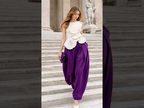
🤍 화이트 상의의 부드러운 곡선과 짙은 보라 팬츠가 만나 색보다 실루엣이 먼저 보이는 룩이에요.
Soft curves in white meet deep purple trousers, letting silhouette lead before color.
LOOK 6
🦚 청록 상의와 머스터드 팬츠의 깊이 있는 대비가 차분하면서도 확실한 존재감을 만들어요.
Teal and mustard create a rich contrast that feels composed yet distinctive.
색을 똑같이 맞추는 대신 실루엣과 볼륨의 흐름을 맞춰보세요. 레드와 그린부터 라일락과 오렌지, 청록과 머스터드까지 서로 다른 컬러도 하나의 스타일 언어로 자연스럽게 이어집니다.
Instead of matching colors, try repeating shape and proportion. From red and green to lavender and orange, these looks show how silhouette can make contrasting colors feel beautifully connected.
Bold colors don’t need to match to feel cohesive. Across these six looks, a defined waist and generous trouser volume create the connection instead.
LOOK 1
❤️ 선명한 레드 상의와 깊은 그린 팬츠, 허리를 잡아주는 곡선이 강한 두 색을 우아하게 이어줘요.
A sculpted red top and deep green trousers feel beautifully connected through a defined waist.
LOOK 2
💛 노랑과 블루의 또렷한 대비에 작은 그린 백이 더해져 컬러가 한층 리드미컬해졌어요.
Yellow and blue create a crisp contrast, while the small green bag adds a playful third note.
LOOK 3
🪻 부드러운 라일락 상의에 따뜻한 오렌지 팬츠를 매치해 예상 밖의 조합을 세련되게 풀었어요.
Soft lavender meets warm orange in an unexpected pairing that feels effortlessly refined.
LOOK 4
🖤 조각처럼 잡힌 블랙 상의가 선명한 핑크 팬츠의 풍성함을 또렷하게 정리해줍니다.
A sculpted black top gives vivid pink trousers a strong, polished frame.
LOOK 5
🤍 화이트 상의의 부드러운 곡선과 짙은 보라 팬츠가 만나 색보다 실루엣이 먼저 보이는 룩이에요.
Soft curves in white meet deep purple trousers, letting silhouette lead before color.
LOOK 6
🦚 청록 상의와 머스터드 팬츠의 깊이 있는 대비가 차분하면서도 확실한 존재감을 만들어요.
Teal and mustard create a rich contrast that feels composed yet distinctive.
색을 똑같이 맞추는 대신 실루엣과 볼륨의 흐름을 맞춰보세요. 레드와 그린부터 라일락과 오렌지, 청록과 머스터드까지 서로 다른 컬러도 하나의 스타일 언어로 자연스럽게 이어집니다.
Instead of matching colors, try repeating shape and proportion. From red and green to lavender and orange, these looks show how silhouette can make contrasting colors feel beautifully connected.
코디언니 | Codi Sister 다른 영상

화려한 스커트에 액세서리를 덜어냈더니 더 눈에 들어와요 | Why Less Accessories Make These Statement Skirts Stand Out
조회수 195

펌프스와 부츠, 같은 미디스커트도 인상이 이렇게 달라져요 | Pumps or Boots? See How the Mood Changes
조회수 244

꽃무늬가 아니라 ‘입체 꽃’이라서 더 특별해 보이는 순간 | When 3D Florals Make All the Difference
조회수 244

화려함을 덜어내지 않고도 우아해질 수 있다는 여섯 가지 증거 | Six Looks That Prove Bold Can Still Be Elegant
조회수 1,538

셔츠는 단정하게, 스커트는 화려하게 입었더니 균형이 딱 맞아요 | A Crisp Shirt Balances a Statement Skirt Perfectly
조회수 1,190

보송한 코트와 매끈한 드레스, 소재 대비 하나로 분위기가 달라져요 | The Texture Contrast That Changes the Whole Look
조회수 92

강한 색을 세 가지나 썼는데도 복잡해 보이지 않는 이유 | Three bold colors, yet the look still feels polished
조회수 810
버건디 재킷에 패턴 팬츠, 과감한데 과해 보이지 않는 조합 | Burgundy and print: bold without looking overdone
조회수 292